
Ecommerce checkout optimization starts with removing reasons to stop: forced accounts, surprise costs, long forms and slow pages. Fix those first, then test your own checkout every month with a real order. You do not need a redesign. You need to find where shoppers get stuck.
The checkout is where a shop earns its money. Visitors have already chosen a product, so the only question left is whether you make buying easy. This guide follows published research on why shoppers abandon carts. It quotes no conversion figures, because those depend on your products, prices and traffic.
Start with the reasons people leave
The Baymard Institute studies checkout usability. It keeps a list of the reasons shoppers abandon carts, built from surveys. Extra costs such as shipping, taxes and fees come first. Slow delivery, distrust of the site with card details, forced account creation and a long, complicated checkout follow.
Notice how many of these are decisions you control. Showing the full price early, offering guest purchase and loading quickly are not features you buy. They are choices you make.
Before you change anything, look at your own numbers. In analytics, find the step with the biggest drop: cart to checkout, checkout to payment, or payment to confirmation. Fix that step first, then measure again.
Make buying easy: guest checkout and fewer fields
Let people buy without an account
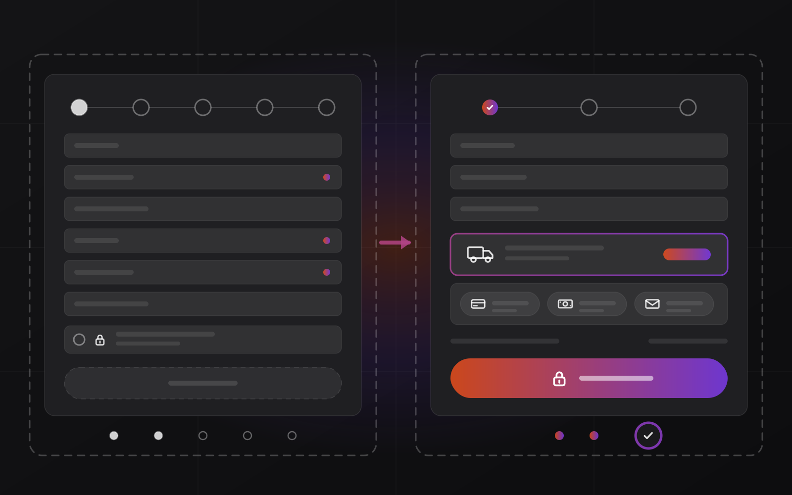
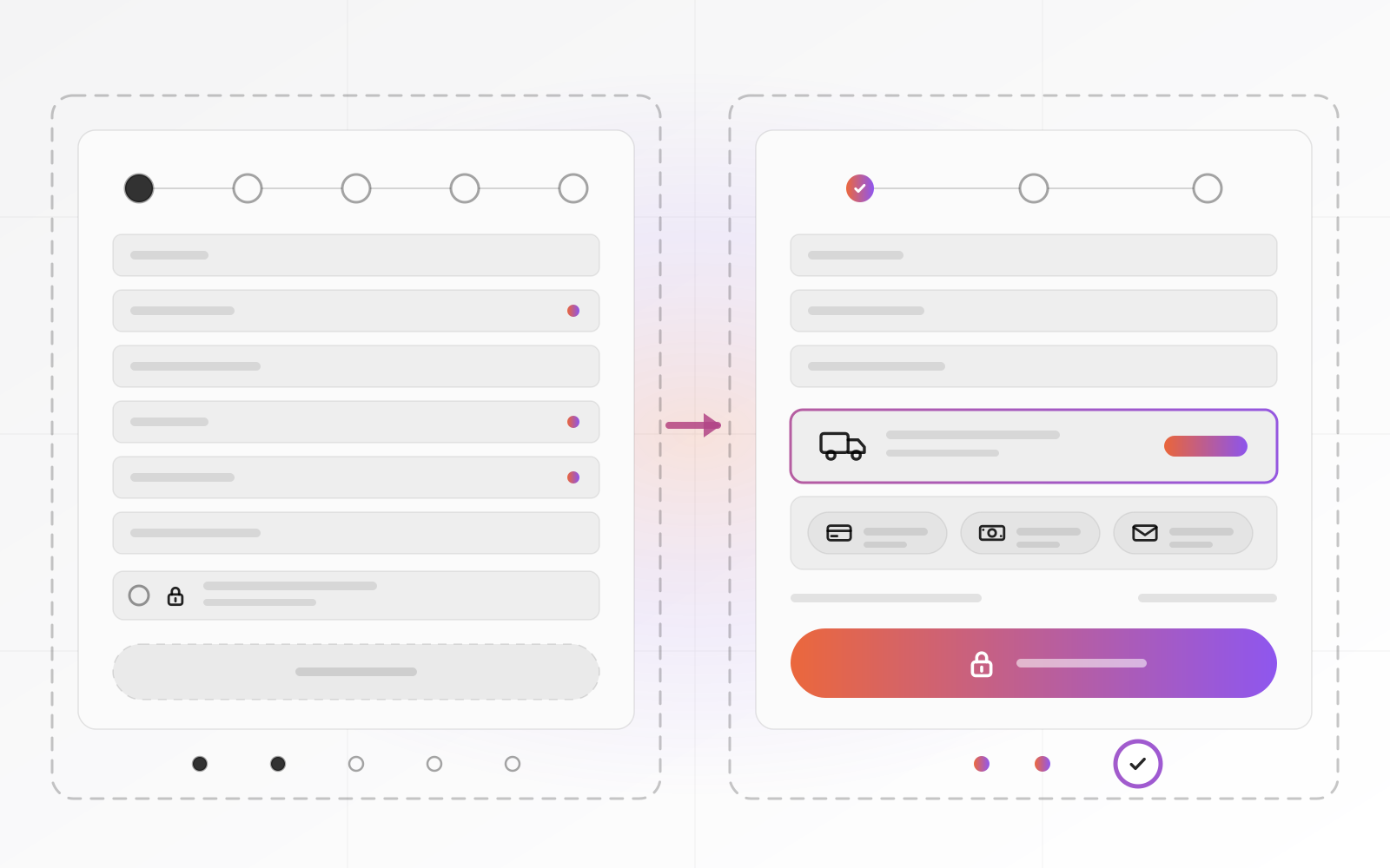
Make guest checkout the default. Ask for an email address, the delivery details and payment, and nothing else. After the order, on the confirmation page, offer to create an account with a single password field. The shopper has already given you everything you need.
Cut every field you do not use
Each field is a small task. Remove company name, title, a second address line and any question about how they heard of you. Move that survey to the confirmation page. Ask for a phone number only if the courier needs it, and say why.
Make forms work with the browser. Set the right autocomplete values so a phone can fill the name, address and card in a tap. Use proper input types, so the phone shows the right keyboard. The web.dev guide to payment and address forms lists the values and explains why numeric fields should not use the number input type.
- Guest checkout is the default.
- One page, or a short sequence of steps with a visible progress indicator.
- Only fields you actually use.
- Correct autocomplete values and input types.
- Sensible defaults for country and city.
- Errors shown next to the field, in plain words.
Show the full price and delivery date early
Surprise costs top the Baymard list, so show delivery cost and tax before the shopper reaches checkout. Put an estimate on the product page or the cart. A line such as "delivered to your city by Thursday" does more than a footer link to a shipping page.
If you offer free delivery above a set amount, say so in the cart and show how much more the shopper needs. If delivery cost varies by city, ask for the city first, then show the price. Never add a handling fee on the last screen.
State your returns policy near the buy button, in one sentence with a link. Shoppers who worry about returns hesitate at the payment step. Baymard lists an unsatisfactory returns policy as its own reason for leaving.
Offer the payment methods your customers use
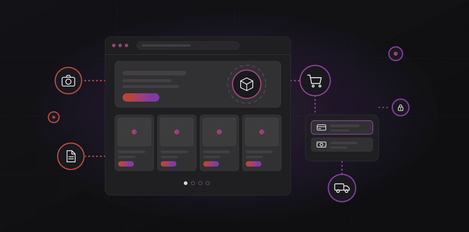
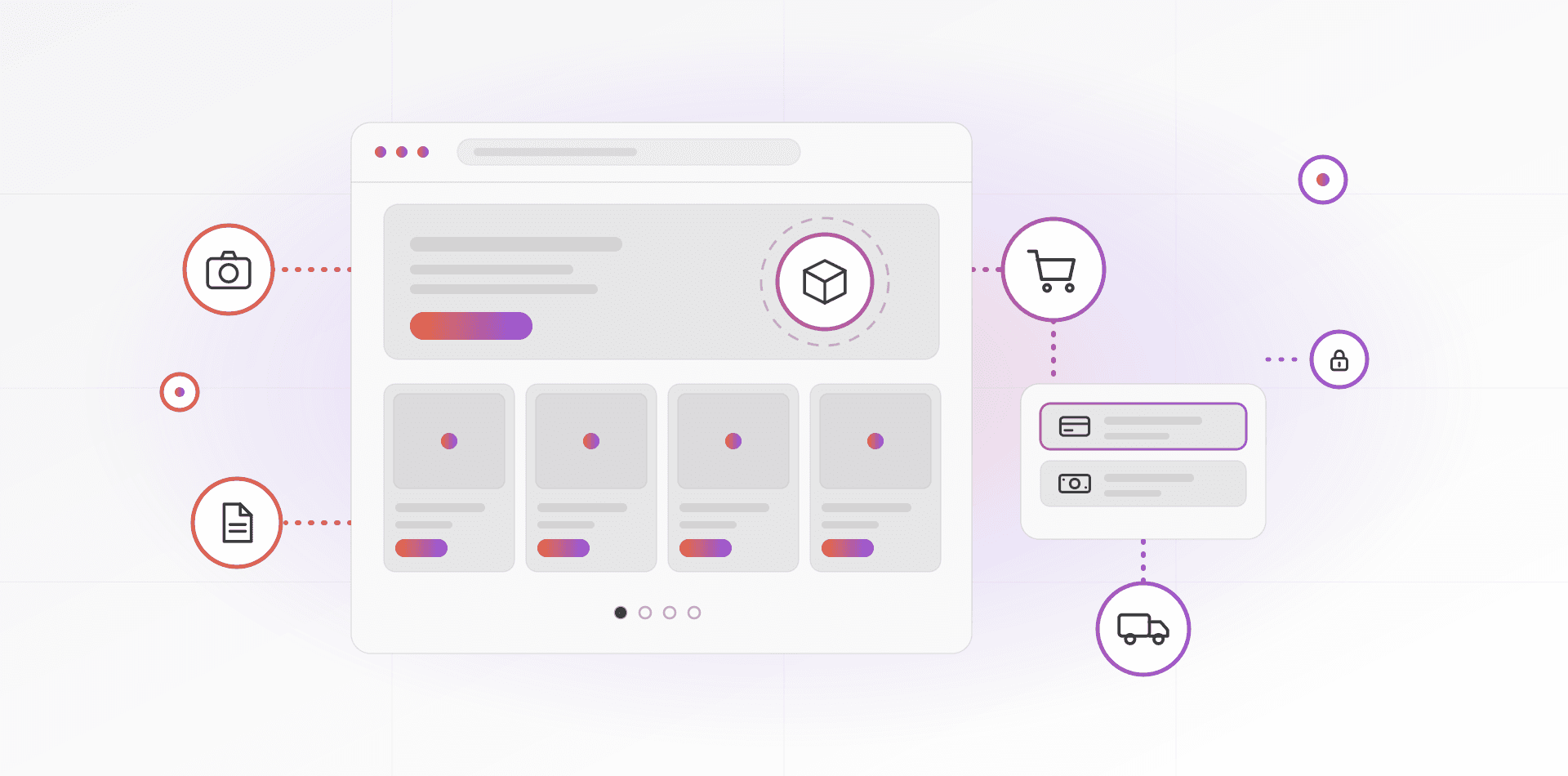
Too few payment methods is on the Baymard list, and so is a declined card. Offer what your buyers already use. In Morocco that usually means cards through a local gateway such as CMI, plus cash on delivery. For overseas buyers, add an international card gateway, PayPal, and wallets such as Apple Pay or Google Pay where your gateway supports them.
Show only the methods you really accept. A row of logos you do not support is a broken promise. When a card is declined, say so plainly and let the shopper try another method without retyping the delivery details.
Cards often trigger an extra bank check called 3-D Secure. Make sure the challenge page opens properly on phones and inside app browsers. For cash on delivery, confirm the order by phone or message before shipping, which also catches wrong addresses.
Build trust with signals that are real
Distrust of card entry is on the research list, and fake badges make it worse. Skip "secure checkout" images you cannot back up. Use signals a shopper can verify:
- HTTPS on every page, with no mixed-content warnings.
- Real contact details: phone, email, address and opening hours.
- A returns and delivery policy linked from the footer and the cart.
- Payment logos only for methods you really accept.
- Real reviews from real orders, including the mild ones.
- Your company name and registration details in the legal notice.
Do not invent urgency either. A countdown that resets on reload, or a "two left" label on a product you stock by the hundred, teaches shoppers to distrust everything else on the page.
Mobile, speed and error messages
Check how many of your visitors use phones, then buy something on one. Buttons need room for a thumb. Keep the pay button visible, avoid pop-ups that cover the form, and remove sliders and chat widgets from the checkout page.
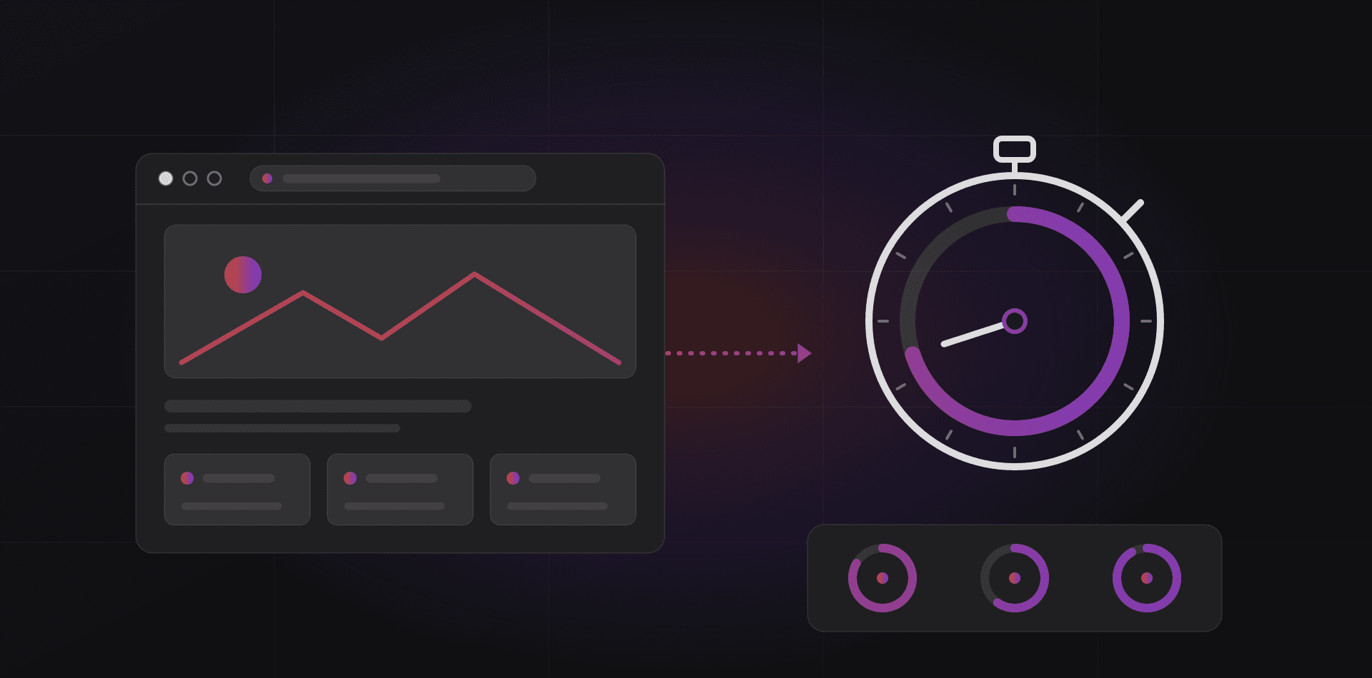
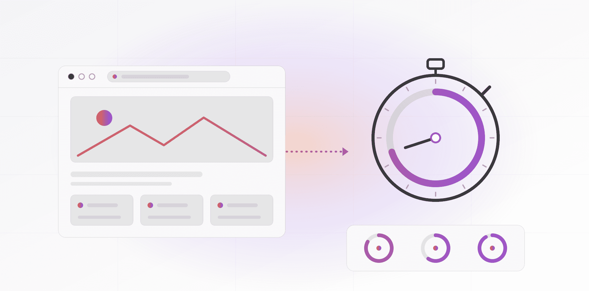
Speed matters here because every extra second is a chance to leave. Google's Core Web Vitals set the targets: Largest Contentful Paint within 2.5 seconds, Interaction to Next Paint within 200 milliseconds and Cumulative Layout Shift under 0.1, measured at the 75th percentile of visits. Heavy scripts are a common cause of misses. Extra trackers and widgets add up quickly.
Write error messages for humans. Say what is wrong and how to fix it. "Enter an email address such as name@example.com" beats "Invalid input". Show the message next to the field, keep everything the shopper typed, and never empty the cart after an error.
Recover abandoned carts and test your own checkout monthly
Some shoppers will leave anyway. A short abandoned-cart email can bring a few back. Send the first within hours, a second the next day, and stop after a third. Show the items, the total and a link that restores the cart. Email only people who agreed to it where the law requires consent, and check the rules for each country you sell to.
Then test your own checkout. A broken payment button throws no alarm. An update can break it on a Tuesday, and nobody notices until the orders thin out. Put a monthly test in the calendar and repeat it after every plugin, theme or gateway update:
- Buy a cheap item with each payment method, then refund it.
- Do it on a phone, on mobile data, in a private browser window.
- Enter a wrong card number and a wrong email address, and read the messages.
- Check the customer's order email, the invoice and the alert to your team.
- Check delivery cost for two cities and one overseas country.
- Run the checkout page through PageSpeed Insights.
Checkout failures are quiet. The only way to hear them is to buy something yourself every month.
Frequently asked questions about checkout optimization
What is a good checkout conversion rate?
There is no single good number. It depends on your products, price, traffic sources and country. Compare your checkout with itself: record the completion rate each month, change one thing at a time and keep what helps. Industry averages mix very different stores, so they rarely help you.
Should I use a one-page or a multi-step checkout?
Either works if it is short and clear. One page suits small carts. A few steps with a progress indicator can feel easier on phones. Test with your own shoppers rather than assuming, and keep the cart visible and the same details asked once.
Is guest checkout really necessary?
For most stores, yes. Forced account creation is on Baymard's list of reasons for abandonment. Offer account creation after the order instead, when the shopper has nothing left to lose and you already hold their details.
How do I find where shoppers drop off?
Use the funnel in your analytics. In Google Analytics 4 the standard ecommerce events are view_cart, begin_checkout, add_shipping_info, add_payment_info and purchase. Find the step with the largest drop, then try that step on your own phone to see why.
Do trust badges help?
Only real ones. HTTPS, accurate payment logos, a clear returns policy, visible contact details and genuine reviews help. Generic "secure" images you cannot back up do not, and they can make careful shoppers suspicious.
Where to go next
If you are launching from scratch, start with how to start an online store. To build or rebuild a store with a short checkout, see our e-commerce website development work or the RAIN Store platform, which has guest checkout built in. Slow pages cost orders too, so read our guide to website speed and Core Web Vitals.
Related articles