
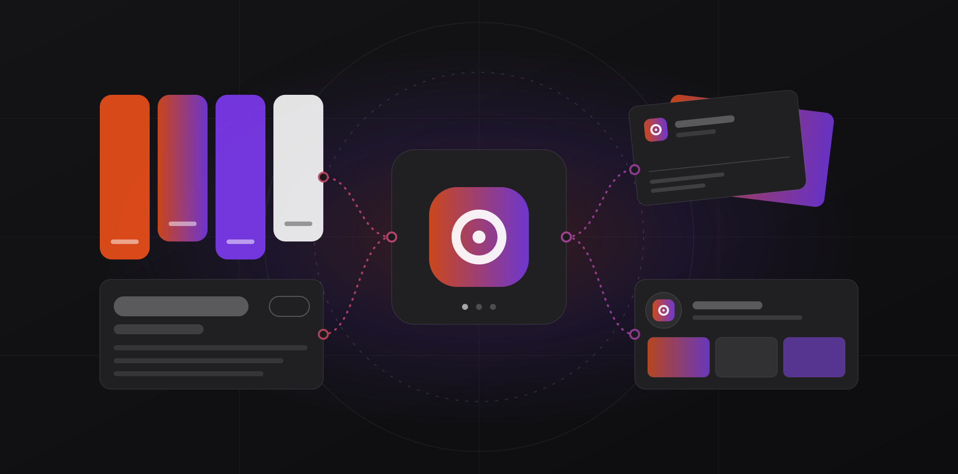
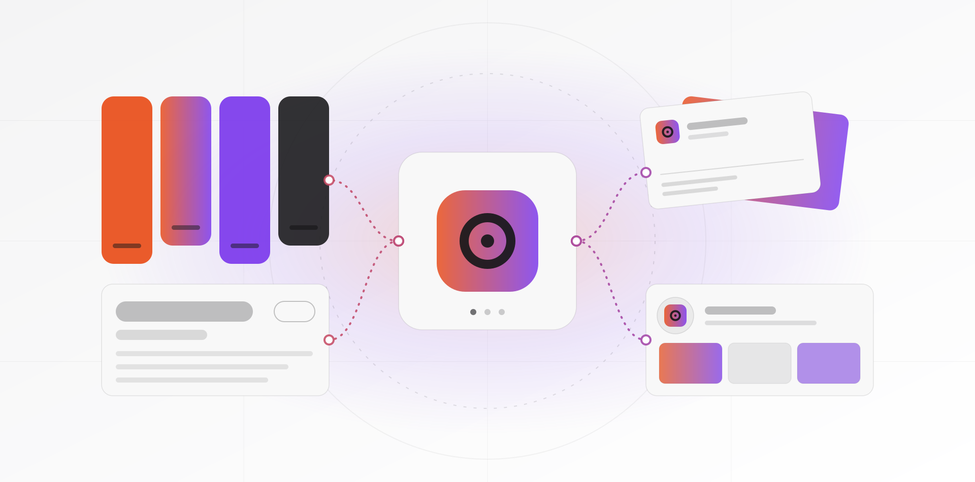
A small business brand identity needs five things: a logo set, two or three colours, one or two fonts, a short voice guide and a handful of reusable templates. Everything else is optional. This guide shows what to ask for, how to brief a designer and how to apply the result everywhere.
Your brand is what customers think of you. A brand identity is the visible and written system that makes you recognisable: the same logo, colours, type and tone, every time. You cannot buy a reputation, but you can design consistency. That is what this guide is about.
The kit a small business actually needs
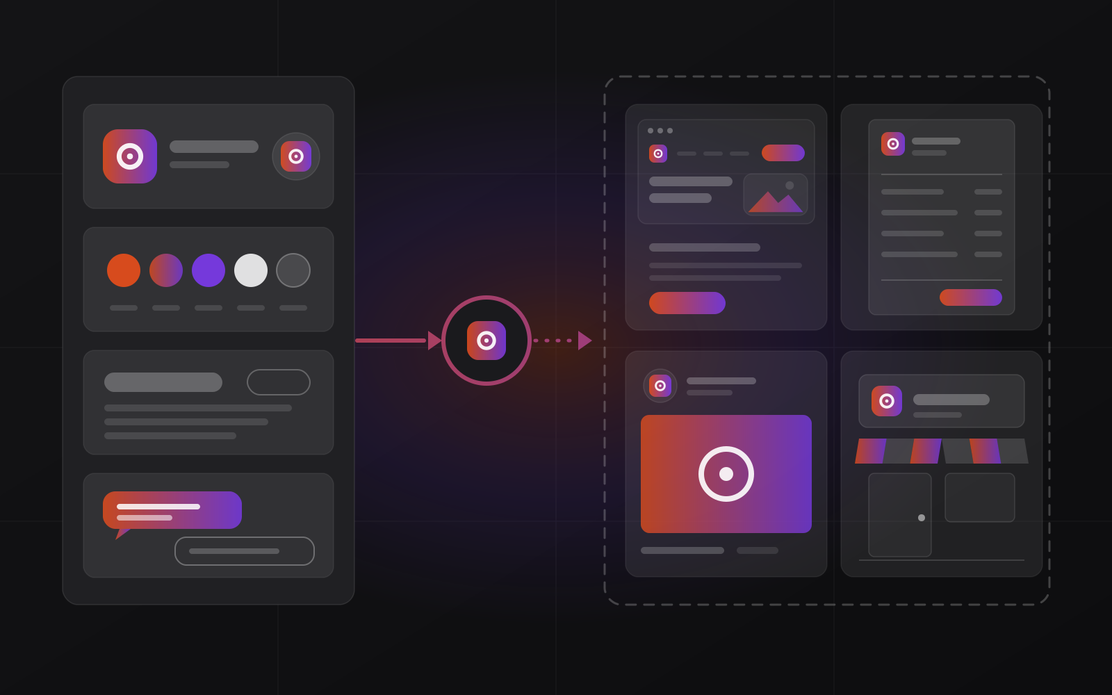
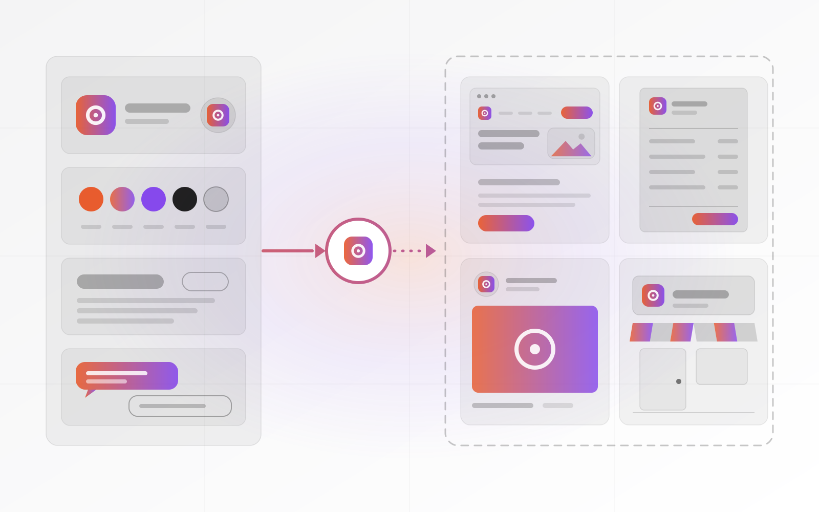
Ask for five deliverables. Together they fit on a two-page sheet, and that is the point. A brand kit you can read in five minutes gets used.
1. A logo set, not one logo
You need a primary logo, a compact version for small spaces and a square icon for social avatars and the browser tab. Add one-colour and reversed (light on dark) versions. Ask for SVG and PDF files for print and signs, and PNG with a transparent background for everyday use.
2. Two or three colours, with codes
Pick one main colour, one accent and a neutral. Get the codes for screen (HEX or RGB) and for print (CMYK, or Pantone if your printer asks). Check that text on your colours reaches a contrast ratio of 4.5:1, the WCAG minimum for body text.
3. One or two fonts, properly licensed
Use one font for headings and one for body text, or a single family. Check the licence. Google Fonts are open source and free for commercial use. Many paid fonts need a separate licence for websites, and that surprise tends to arrive after launch.
4. A half-page voice guide
Write three words that describe how you sound, such as direct, warm and plain. Add two or three example sentences, and a short list of words you use and words you avoid. If you work in several languages, say how each one should sound.
5. A few templates
Templates do most of the daily work. You need an invoice and quote, an email signature, a social post, a slide or proposal layout and a business card. A template locks in the logo, colours and fonts, so nobody has to remember them.
What agencies sell that you can skip, for now
Some of what agencies sell is useful. It is just rarely the first thing a small business needs. A naming workshop helps when you launch a new company. A strategy sprint helps when you cannot say who you serve. A 60-page guidelines book helps when 200 people must apply the brand without asking anyone.
Postpone packaging systems, motion identities, brand videos, mascots and sub-brand structures until you have a clear need. Be careful with logo contests and instant logo makers too. Many hand you a file without clear ownership, and some hand you a design that others already use.
Whoever designs your logo, get the rights to it in writing and ask for the source files. Then check that nobody in your trade already uses a similar name or mark. WIPO's Global Brand Database is a free place to start. A trademark attorney, or your national office, OMPIC in Morocco, can confirm. This is general guidance, not legal advice.
How to brief a designer
A good brief is one page. It saves rounds of revisions, and it protects you from paying for a logo that looks good but does not work. Include these items.
- What you do and who you serve, in two sentences.
- Three words you want people to use about you, and three you do not.
- Two or three brands you admire, with a sentence on why.
- Where the logo must work: a sign, a van, a phone avatar, an invoice, a browser tab.
- Languages and scripts, including a right-to-left Arabic version if you need one.
- Deliverables and file formats from the kit above.
- Your budget range, because it shapes what is possible.
- Who approves, by when, and how many review rounds you have agreed.
Ask for two or three directions at most, each with a short reason. More choices do not give you a better logo. They give you a longer argument. Give feedback the way our website design process guide describes: say what you see, not what to change.
Apply it the same way everywhere
A good kit fails when it is applied badly. Keep one folder called Brand with the final files, and name one person who owns it. Then work through each place your brand appears.
- Website: use the SVG logo, set the colours and fonts once as shared styles, and add a favicon. Google's favicon guidelines ask for a square image, recommend one larger than 48 by 48 pixels, and want its address kept stable.
- Documents: send invoices and quotes as PDFs made from a locked template, with the logo and colours already in place.
- Email: one signature template for everyone, with the same logo file and contact layout.
- Social: crop the icon mark for avatars, because many platforms show them as circles, and keep a template for post images.
- Signs and print: send vector files and CMYK values, and ask the printer for a proof. Colours on screen and on vinyl or paper never match exactly.
Consistency beats creativity here. A customer who sees your invoice, your van and your website should recognise one company without thinking about it.
A brand kit you can read in five minutes gets used.
When a rebrand is worth it
A rebrand is worth it when the old identity blocks the business. That means one of these: you changed what you sell or who you serve, the name or logo causes legal trouble or confusion, the logo fails at small sizes or on dark backgrounds, you merged with another business, or your look undermines trust with the customers you want.
It is not worth it because you are bored, a new manager wants a new mark, or a competitor changed theirs. A tidy-up often does the job: clean the logo, fix the colours, pick better fonts, keep the name. That is a refresh, and it costs less than a rebrand.
Count the hidden costs first. Signs, vehicles, uniforms, printed stock, packaging, directory and map listings, email signatures, social handles and every page of the website all change. If the name or domain changes too, plan the redirects with care. Our guide to redesigning a website without losing SEO covers that part.
Frequently asked questions about small business brand identity
How much does a brand identity cost?
It depends on scope, so we do not quote a price here. Define the kit first: logo set, colours, fonts, voice and templates. A fixed list makes quotes comparable. Our pricing page explains how we quote. Be wary of any offer that cannot say exactly which files you will receive.
What is the difference between a logo and a brand identity?
A logo is one element, the mark that identifies you. A brand identity is the whole system around it: colours, fonts, voice, templates and rules for using them. A logo alone gives you a symbol. An identity gives you consistency across your website, documents, social posts and signs.
Do I need brand guidelines?
Yes, but keep them short. Two pages covering logo rules, colours, fonts, voice and a few examples are enough for most small teams. A long book suits large organisations where many people produce material. If nobody reads the guidelines, they are just a PDF.
Which file formats should I ask for?
Ask for SVG and PDF versions of every logo, PNG with a transparent background, a square icon file for favicons and avatars, colour codes in HEX, RGB and CMYK, and the source files from the design tool. Ask for the font files or their licence details too.
Can I design my own logo?
You can, and a simple wordmark in a well-chosen font can work. Hire a designer when the logo must hold up on signs, in one colour, at tiny sizes or against crowded competitors. Either way, test it on your phone, on a dark background and printed small.
Where to go next
See what we offer on our branding page, and read how our design and brand systems connect to a website. If you are weighing a bigger project, learn how a website design project runs, or book a call.
Related articles